
Humble
UX and UI for app concept
Lead Designer
The job search process is due for an overall. Just as Tinder, Bumble, or even Match.com disrupted how we date in the modern age, Humble aims to do the same with how we find our next career opportunity.
Humble candidates swipe right if they like a company’s job listing. Recruiters swipe right if they like a candidate’s profile. When both sides swipe right, it’s a match. Once matched, candidates and recruiters have direct access to each other, putting an end to all that anxious waiting.
My role in the project was UX and UI design, including user research, competitor analysis, information architecture, wireframing, and prototyping.
Understanding the target
At the onset of this project, it was important to understand the current landscape—how are people applying for jobs, what are the problems, where are the holes—and how can Humble be a differentiator in the market.
Through qualitative user surveys, we gained helpful insight into the candidates’ experiences, their thoughts and feelings, and any challenges they faced.
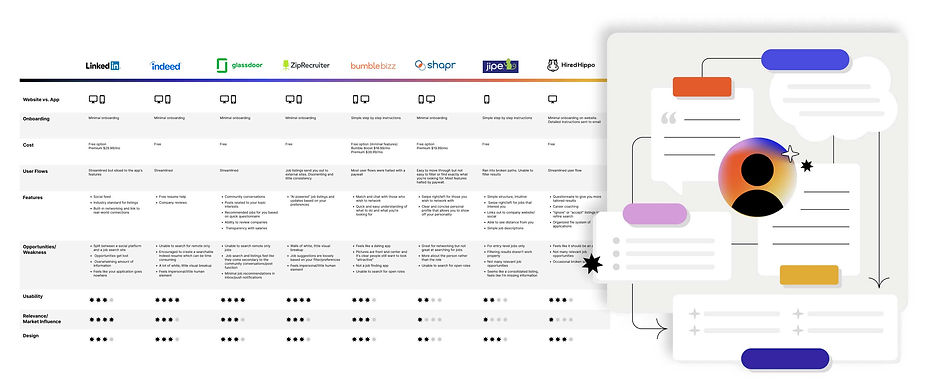
During the competitor audit, we looked at top job search apps and sites, dating apps, and other apps with similar functionality. The simplicity and ease of use of dating apps are what caused them to catch on like fire, and we wanted Humble to be similar. But we knew there were big fundamental differences between finding a partner and finding an employer.
“So much of the success of dating swipe apps is based on the simplicity of swiping on someone’s picture if you think they’re hot. From an HR perspective, that’s the exact wrong reason to pick somebody.”
– Social feedback
Persona and user journey
Through our qualitative research, we learned there’s a large whitespace in the marketplace for a product that feels more personal, more human, and can offer direct one-on-one between candidates and recruiting teams. Based on the data collected from the interviews, we created a persona that encapsulates our target user. This persona allows us to intuitively understand what the users are thinking and feeling throughout the job search process while also providing possible opportunities that can be implemented at each stage of their journey.


Product structure and flows
In the concepting phase, we’re able to ideate in-app solutions for our user's needs. Site maps, user flows, and wireframes help us understand how users move through the app while giving us a better understanding of information hierarchy.
Bringing it all to life
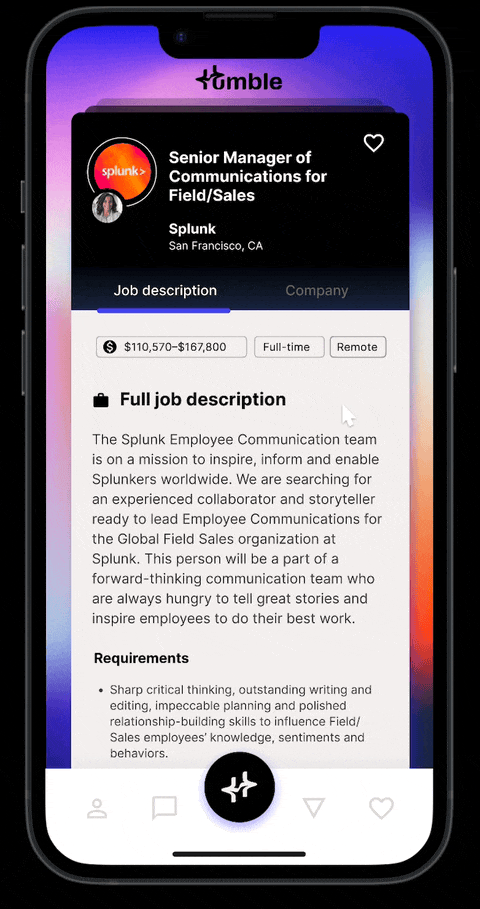
Once the structure was in place, I was able to easily design the high-fidelity mockup. Figma prototyping allowed us to work through user interactions and build upon the wireframe base.
A style guide and pattern library were built to ensure consistency while also creating the building blocks for future development.


